Optimizing for mobile is one of the key pillars of digital marketing. We talk about this a lot at NHM and that sparked an idea of figuring out how the most successful online stores are faring on mobile.
To answer that, we audited the Top 100 most successful Shopify stores globally. Our goal here is to evaluate the entire shopping experience strictly on mobile from landing on the homepage until the checkout process. In this case study, we will walk you through our key mobile insights and why we think these sites are on the top.
Methodology
First, we had to find an accurate and most recent listing of top Shopify stores. After scouring online, we landed on Link Hero’s top 100 list. The rules were simple, we had to go through the entire list and shop ONLY using a mobile device.
Step one was to open the homepage and analyze the above the fold elements. We recorded our findings on a spreadsheet then moved on to selecting a product. On the product page, we assessed how images were used and how easy it was to find relevant information. As a final step, we went through the add to cart experience and the checkout process.
Insights
For split our findings into four categories – homepage as the landing page, product page, cart and checkout – to best reflect shopping experience most users will go through. Of course it is possible to start from the product page and skip the homepage, but it is still a very important part of the flow for most users, and also one that most websites will spend a lot of time on. Just like First Input Delay does for Core Web Vitals compared to all other input delays, first experience can matter more than the ones that follow.
Here’s what we learned from each step.
Homepage
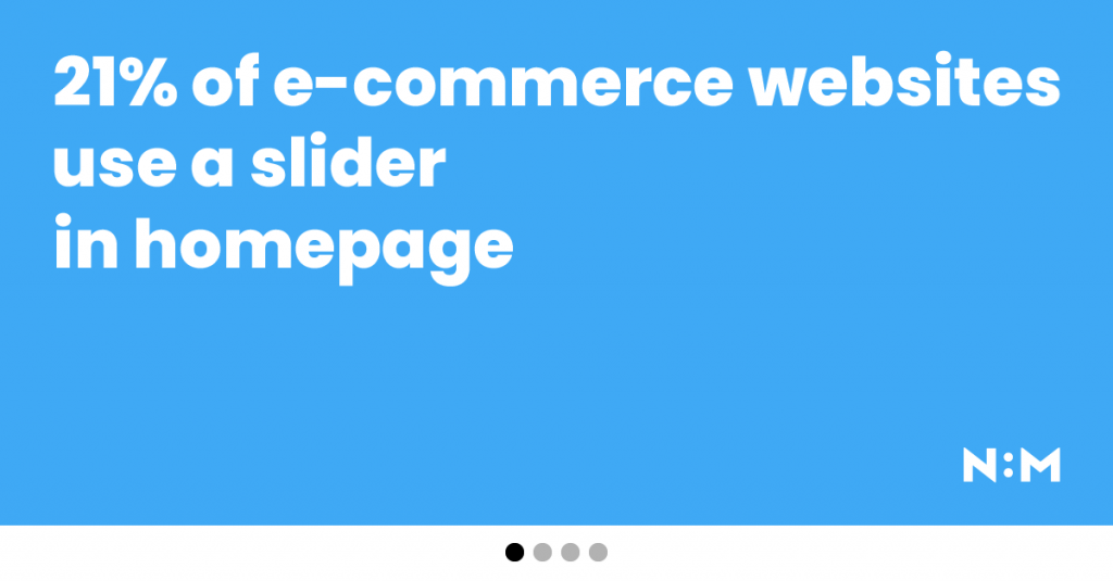
- 66% have single images on the homepage; Only 21% are still using sliders
- Half of the websites were promoting a sale campaign (ex. memorial day sale)
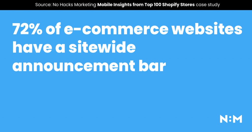
- 72% were using announcement bar (14 multi)
- 40% had search always on
A few things really stand out. First of all, four out of five of these successful stores do not use sliders in their homepage. Could be simply because sliders suck, annoy users and reduce visibility, or who knows what else, but they seem to be on their way out, at least among the elites.
Another really cool trend was just how many websites used that thin announcement bar at the top of the page. Only three out of ten websites did not have anything in that space, 71% of the websites we looked at used it to show shipping and/or return policy, push a campaign or a new collection. For most of these websites, the announcement bar was present site-wide, except for the checkout page.
Finally, the search box. 40% of all websites had it expanded by default. If you consider the fact that there were a lot of stores that only sold a few products, that means close to half of those that had a large catalog (where search becomes handy) had the search box always visible on mobile devices. Mobile is the key here because no matter how great your navigation is, it can still be difficult to find what you’re looking for on a tiny screen.
Product page
- 69% had no thumbnails in the product gallery and relied on dots or arrows instead
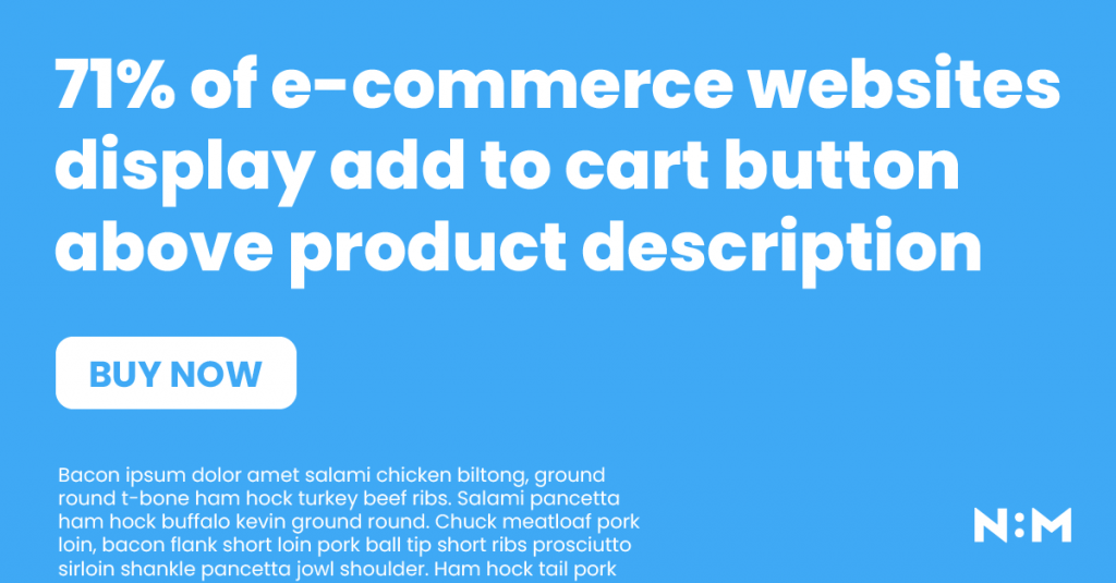
- 71% of the websites had add to cart displayed before any description
- 13% floating add to cart (consider variables)
- 68% had some type of cross-sell/up-sells
Product page needs to do one thing well – get user to add the product to cart and continue to checkout. For some users that means you’ll need to convince them your product is the right for them, while others will already know and just want to complete the purchase as quickly as possible.
For those that need convincing, few things can do the job as well as great product images. However, making a lot of them visible at the same time is not how these top-performing stores approach it.
The reason for this is (likely) the fact that tiny little thumbnails offer no value at all – you still need to open the large image to see all the details, and the thumbnails make unnecessary HTTP requests and take the extra space, pushing your price and add to cart button down and possibly below the fold.
Having spent a lot of time working with WooCommerce, I can’t help but draw a parallel between Shopify and WooCommerce here. In WooCommerce, tiny thumbnails as a navigation device for the product gallery is a platform default and the way it is handled by almost all WooCommerce stores. I am not saying there’s one UX pattern that will work for every single store, maybe your audience needs the thumbnails, but relying on platform defaults without thinking them through is never a good thing.
And just how important is having that add to cart button high up in the page? Extremely, according to top 100 Shopify stores. 71% of them had the add to cart button shown before any kind of product description was shown. Let the images, price and product name do most of the talking, but have a description one small scroll away in case there are any questions. Like an ideal store clerk.
Another 13% had a floating add to cart button, always visible at the bottom of the page. This is a very good design pattern that can help those long product pages, especially if you’re selling a product users may not know that much about and will want to read the description.
Last one here, more than two thirds of top 100 Shopify websites had some kind of cross offering displayed in the product page. For some that was cross-sells (“you may also be interested in”), for others it was up-sells (“complete the look”), but there were also several websites that had both. This is one thing that is absolutely worth testing in pretty much any store with enough products, but never implement it blindly and always monitor if those products are getting any clicks and how those clicks affect the bottom-line.
Cart
- 76% have slide-in cart modal, 15% opens to a new cart page
- Only 44% had some form of up-sell
- 93% had no coupon code
- 75% had no secondary call to action – focus is to check out
This is where things get interesting and the difference between Shopify and WooCommerce couldn’t be starker. Again, it’s all about platform defaults. So what happens when you add a product to cart?
76% of top 100 Shopify stores show you a slide-in cart modal, usually from the right side or top of the screen. Only 15% would take you to dedicated cart page automatically, while the remaining ones would stay in the product page and show you a notice. Here’s that parallel again – this is the default way in WooCommerce, to reload the page and show you the same page you just saw again, with a little notice at the top.
Not saying which one is best, let’s just all agree that using platform defaults without even questioning if they are the best way for your store is lazy.
Another way these two platforms differ is the coupon code field. Most of the Shopify stores we analyzed don’t have it in the cart page (or slide-in window), while in WooCommerce the coupon form and its call to action are there by default, competing with the real call to action.
And speaking of competing CTAs, 75% of the stores had none in their cart page/window. That includes “Continue shopping”, although with most of the stores having those easy to close slide-out windows, that one really wasn’t necessary.
Also less than half (44%) of the stores had no related products shown in cart, clearly the thing that mattered the most was getting the user to the checkout page.
Checkout
- 96% had no navigation, 80% had a progress bar
- 55% had product thumbnails
- 91% had coupon code
- 83% had express checkout
This is the one we had high hopes for, but it turned out to be very dull and “platform defaulty”. WIth Shopify you need to be on their Plus plan to edit the checkout page template, which is why most of these checkout pages looked very similar. Simplified design, no main navigation, checkout progress indicator. This is one platform default I mostly agree with, no matter what you’re selling the checkout page needs to be simple, fast and efficient.
Which is probably why so many (83%) of stores chose to use at least one express checkout option, whether that’s PayPal, Google Pay, Apple Pay, Klarna… There’s only one thing you want the user to do here – complete the transaction. Anything else in the checkout page is a distraction and it’s great to see Shopify thinks so, too.
Learnings
- Announcement bar is a great way to promote any offers or campaigns you currently have, 72% of the stores had this
- For stores that sell many products search bar always on is a popular way to go
- Thumbnails on product gallery are not recommended (on mobile)
- More than 7 out of 10 stores show add to cart button above any kind of product description
- Platform defaults are a tricky thing, they help you get started faster, but don’t just trust them blindly and always test what works best for your audience
- This one is very subjective, but only 30% of the websites had decent design, the rest were not looking great but clearly still converting
- Checkout needs to be as distraction free as possible and express checkout options help